Sentimental stitching
The game has been so successful in selling loyalty back to fans that the thing loyal fans hate most is the idea that a marketing campaign might work and attract new fans — ugh!
Most football shirt designers lean on history now, but the shirts Adidas have made for Leeds United so far have been leaning on the wrong part. Only when AcidFC deconstructed a 1970s peacock — among other things — and mixed it with rhubarb and custard have Adidas pulled anything truly new out of the club's past. Left to their own devices, their best efforts have not borrowed from the club's history, but from historic shirt designs. A blue and green striped effort that was an homage — copy — of Asics' blue and green striped effort from the 1990s. An all-yellow affair with a smiley badge and blue and white sleeve trim, doing over what Admiral did best in the 1970s.
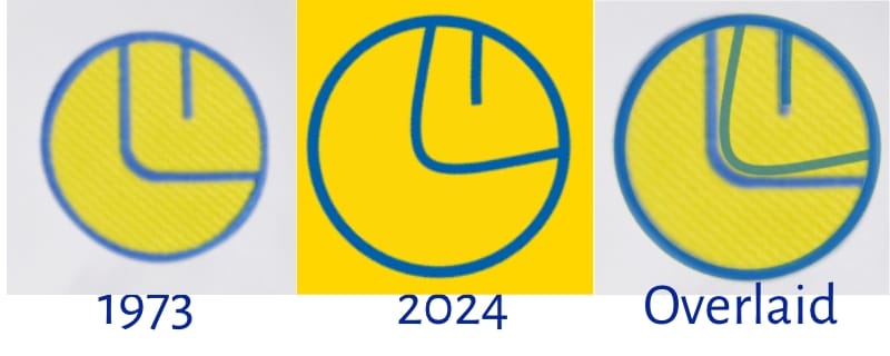
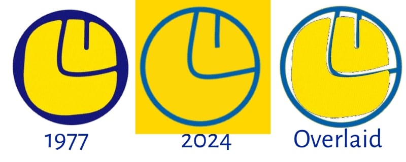
And while we're on the subject, this is my chance to finally get a problem off my chest: the jaw on Adidas' re-drawn smiley is too damn big. They've made the line on the right side — going away from the jaw-hinge towards the 'front' of the face — curve upwards, giving the smiley something it never had in the 1970s: an underbite. It's gurning. It took me ages to work out what was weird about it, and eventually I worked out that they'd taken the squishy and pillowy grin-and-eye from the later-1970s squarish smiley version and drawn them into the slickly geometric 1973 circular smiley version, producing a sort of bastard son of the smiley that by trying to put a square in a circle is less than the sum of the two perfectly good original versions.
Or possibly I'm deranged. Part of my derangement is that these thoughts originally followed leaks of the next away kit, which is apparently based on Nike's blue number from 2001, and how I associate that shirt with Carl Shutt. But the home one has been released first, taking me in a different direction, meaning you haven't heard the last of this as we'll save Shutty for later.
The new home shirt is white, which is always a relief, but still bears an enormous Red Bull logo that has a distorting effect. Their brand is already so pervasive in sport that the eye is drawn to it first and the brain follows: oh, it's a Red Bull Salzburg shirt, oh it's Leipzig, oh it's New York, oh bloody hell it's Leeds. Perhaps this explains the extra attempts at Leedsing it up, although lots of Adidas' club's have a 'sign-off motto' on the back of the collar this year, so it's more them than us. The words 'We are Leeds' — better than 'All Leeds aren't we' — are combined with a scarf motif, that was registered as a club trademark last summer. Then, on the collar and cuffs, there is a 'sentimental tribute' to the 'iconic Lowfields Tunnel' and its municipal pattern of blue, yellow and white tiles. Or, as the press release says, as if the tunnel survived the eruption of Vesuvius, its 'significant mosaic'.
Usually when football clubs have tried to incorporate some local physical feature into their shirts it has been so obscured it's nonsensical. A 'subtle print' in the new Wolves shirt is apparently 'inspired by the Molineux Pleasure Grounds, a public park that used to be located where Molineux Stadium now stands', as I'm sure will be obvious to Wolves fans from the first glance, while Burnley have gone for a print 'inspired by mapping, and the contour lines of the surrounding hills'. The new shirt in Salford has sleeves full of graphics 'inspired by Old Trafford' that not even the hardiest squinter can make look like their condemned stadium.
To keep reading, please become a More to Read or More Listening member
Leedsista is supported by Leeds fans who think decent writing about their football team is worth £3 a month to read, or £5 a month for a podcast version.
Try free for 30 days.